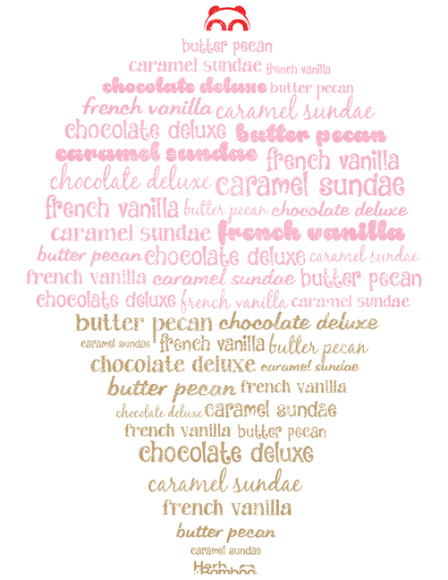
In Vol. 2 of Ice Cream Series, the hand drawn text was the focal point. For Vol. 3, we decided to put the flavors in the spotlight. Using the flavors as wallpaper in Vol. 2 lead to this installment’s creation. Our thought was, “What says ice cream more than ice cream?” The answer to our questions was: NOTHING.
Simply listing the flavors would not have been a very good solution…unless they were listed in a fun way. Another obstacle we encountered was deciding on the proper letter style(s). Using a ton of different fonts in one design is an easy way to make your design look jumbled and chaotic. Here we created a chaotic list that is fun and functional. All of the flavors are represented, and the design itself clearly says “Ice Cream” without having to spell it out. In a way, our solution is a bit simple, but we feel that it all came together very nicely. We even added a nice little cherry on top.
Click on Our Farm to see the Ice Cream Series in its entirety.
Thank you for your continued support,
~Herb & Bamboo
www.facebook.com/herbandbamboo
www.instagram.com/herbandbamboo
www.twitter.com/herbandbamboo
#EnjoyYourself

